Chloe Warner: Redmond Aldrich Design
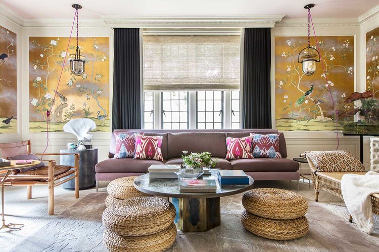
Meet the ever-so-stylish Chloe Warner, the visionary behind Redmond Aldrich Design. With an artist mother and a scientist father, Chloe scored big on a well-rounded gene pool! Read on to see how she brings this right-brain/left-brain talent to her interior design projects. And get a glimpse into our collaboration with Chloe at this year's San Francisco Decorator Showcase.
You have a master’s degree in Architecture - how does that impact your approach to interior design?
It made me realize that what I feel passionate about is atmosphere, and there are many different ways to go about creating atmosphere. Architecture for sure, but also color, light, art, pattern, they are all tools at your disposal. I love to deploy them all!
We love how much wallpaper you incorporate into your projects! In what scenarios do you feel that wallpaper is a better choice than paint?
Speaking of atmosphere, wallpaper is such a potent way to create a mood. In general I love to use it on all four walls to create a cocoon, and then layer other colors and pattern to create something magical.
Speaking of wallpaper, the “wallpaper floral” fabrics you favor add so much distinction to the mix. For the pattern shy, give us your best argument for using a floral.
I adore old fashioned florals - hand blocked with several colors. They bring a timeless vibe, and I’ve always thought that a thoughtful mix with a ton of harmonious elements will outlast a severe edit.
Most designers use the standard animal prints (zebra stripe, leopard spots, etc) to amp up the energy. You’ve gone in a different direction - sculptural animal lamps and framed animal prints, even taxidermy - besides being the daughter of a zoologist (cool!), why?
I never go out of my way to incorporate animal or earth elements, but it’s definitely a thread throughout my work. I’m not against animal prints, but it’s only one way to go and I would never limit myself.
You incorporate so many vintage items in your projects - furniture, lighting, sculptural objects - besides (in some cases) lower cost, what is your reasoning?
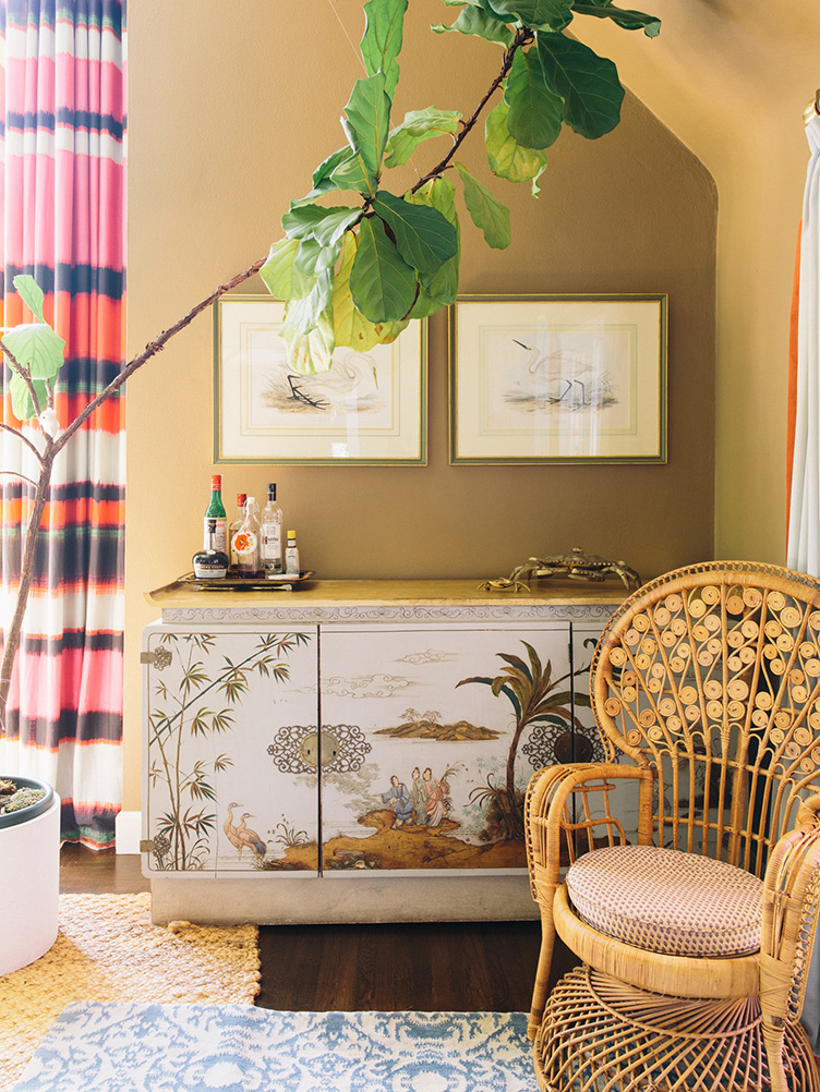
I am so omnivorous! The effort required to source from vintage sources, retail sources, custom sources and trade all pays off - you can calibrate the mood of a space so perfectly if you mix high and low, precious and humble, masculine and feminine, etc. Like a great cheese plate or a good party, all kinds should be represented.
Now give us your favorite sources! :)
I love Chairish and eBay, followed by a trip to Revitaliste! I also love 1stDibs, Woven Accents, and The Future Perfect.
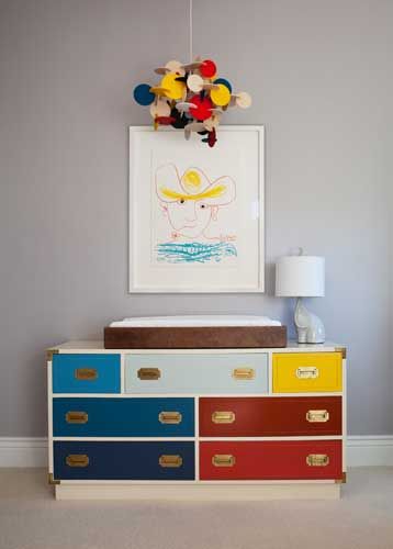
One of our favorite furniture projects you revitalized was a boy’s dresser. Tell us about your inspiration and design choices.
I was very inspired by an unattainably expensive Scandanavian piece on 1stDibs, and recreated the vibe with an eBay find. This happens all the time :)
Your projects range from vibrant neo traditional to luxe minimal. How do you decide when to add and when to subtract?
I think of it in terms of temperature - I like to cool down the old and warm up the new. To what degree depends on the client every time. They inspire me.
Lastly, it was so much fun collaborating with you on San Francisco Decorator Showcase! Tell us what inspired your dining room and your favorite pieces.
Our collaboration on Decorator Showcase was such a thrill - it had to happen so quickly which meant there was no time for second guessing, which I love. Our main challenges were the scale of the dining room - it’s huge - and the oppressively dark wood everywhere. This meant we needed a dining table that wouldn’t feel dwarfed, and let me tell you that it’s not easy to get your paws on a huge chic dining table that is ready to go. I found an amazing Gio Ponte table on Chairish but the scale was too small. It was so great to be able to work with Revitaliste to replace the original top with the perfect size table top for the room. A 10' top is perfect for that space, but we never could have found it "off the shelf.” And the chairs - vintage Knoll - we lacquered and reupholstered in an Yves Klein blue - bring brightness and informality to a room that was so dark and formal, they are perfect.


